YouTube: A New Way to Filter
A new filtering feature incorporating tags to YouTube's Homepage for more personalized content.
Background
Problem
The platform falls short of offering personalized options to its users. Users are constrained to rely on YouTube's recommendation algorithm, which suggests videos based on their viewing history. The current exploration experience offers insufficient filtering options, which poses a challenge for users attempting to streamline their searches to find content that suits their tastes, interests, and viewing patterns.
Solution
Develop a user-friendly and effective filtering feature that empowers users to easily navigate and explore YouTube, enabling them to refine their search results, discover new content, and ultimately enhance their overall viewing experience by tailoring it to their individual preferences.
Empathize: Understanding User Needs and Pain Points in Filtering YouTube Content
Research Goal
The main research goal is to understand the issues with the lack of customization on a YouTube feed and learn if the addition of incorporated tags can improve a user’s YouTube experience (viewing, exploring, discovering) and a creator’s YouTube experience (outreach, viewership, more interactions).
Research Objectives
Explore the issues individuals have with their YouTube Home page. Do they like what is being recommended to them?
Learn how individuals feel about customization/ having control of their feed, Is it a process they’re familiar with? Will they use it if given the option?
How are other websites with a similar feature executing the experience
Find out the optimal way to organize tags so that the whole process is seamless and intuitive.
Competitive Analysis: How are similar platforms doing this?
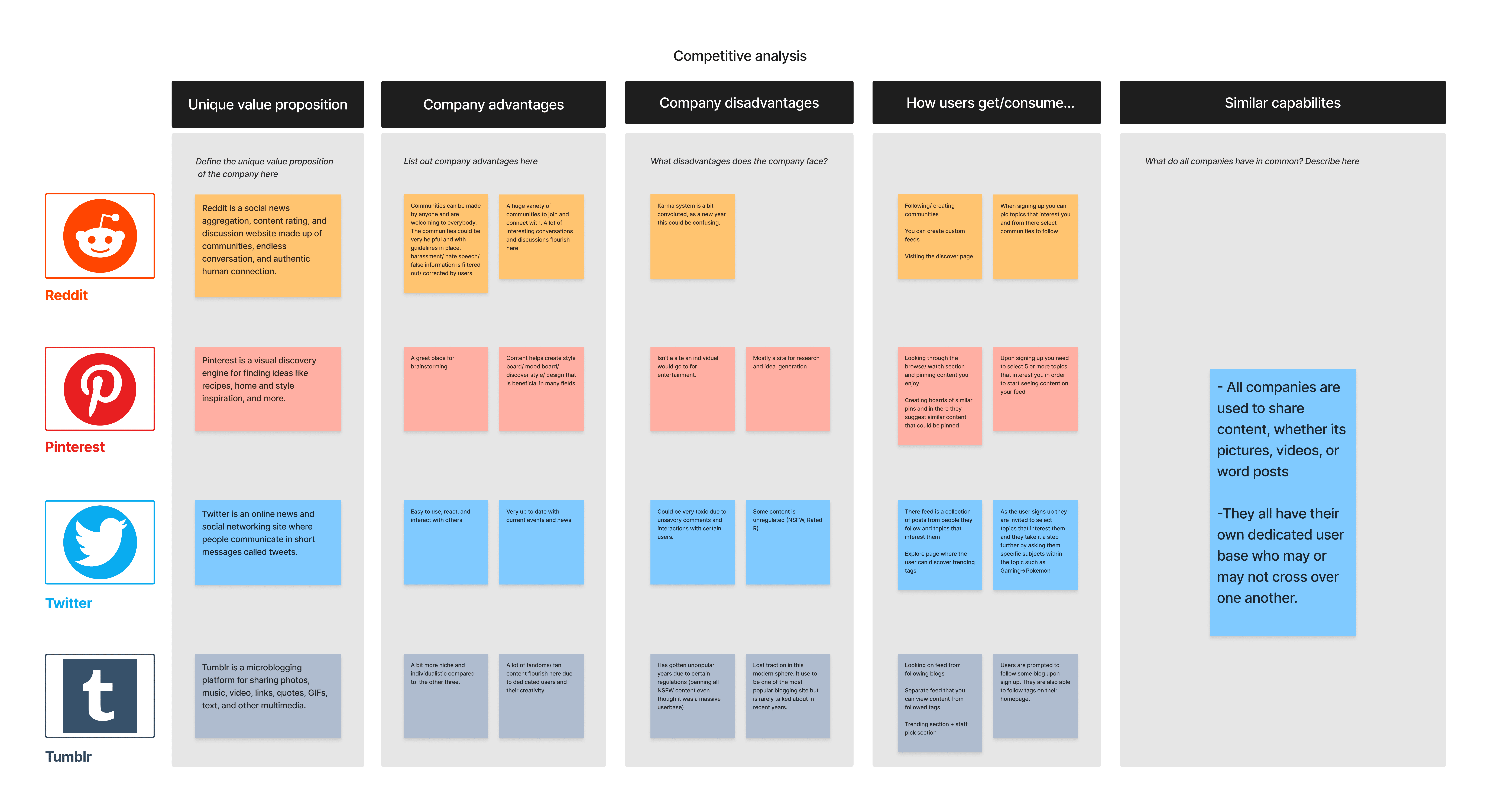
I evaluated popular social media platforms such as Reddit, Pinterest, Tumblr, and Twitter to gain insights into their filtering and content discovery mechanisms. By comparing these platforms, we identified key strengths and weaknesses aiming to combine the best aspects of these platforms while addressing their limitations to deliver an optimized content discovery experience for YouTube users.
All platforms have a step in their sign-up process to pick out topics to start their feed.
Reddit excelled in its community-driven content curation and customizable filtering options. You choose the topics which would then introduce you to communities to join
Pinterest stood out for its visually-oriented browsing experience
Twitter provides real-time content updates through its trending topics. You pick topics and then take it a step further by having the user pick out something even more specific
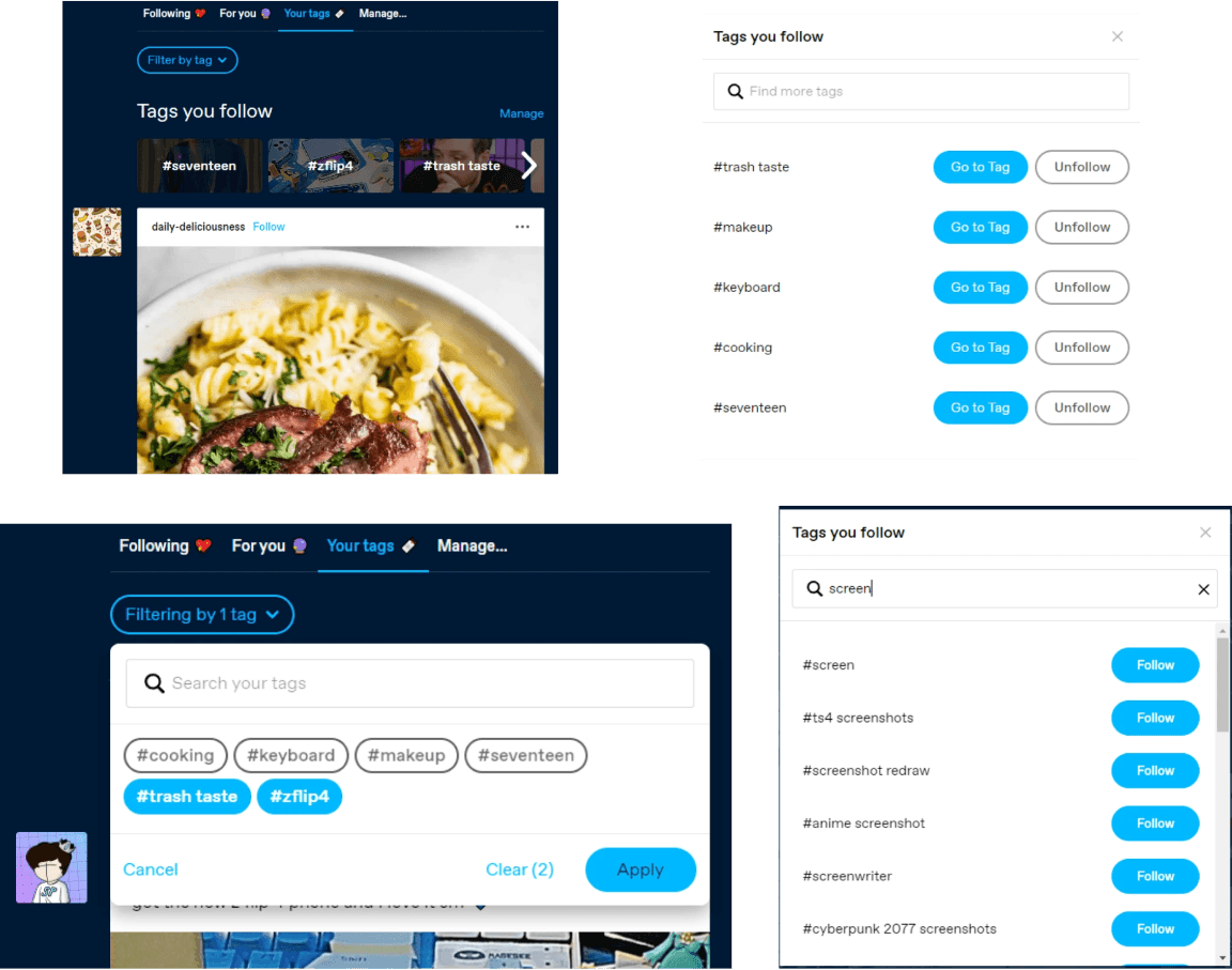
Tumblr emphasized personalization through user-curated tags. There are different feeds on your homepage, one shows the content of people you follow and another one would tag you follow. The tags are added by searching in a search bar.
User Interviews
Pain Points
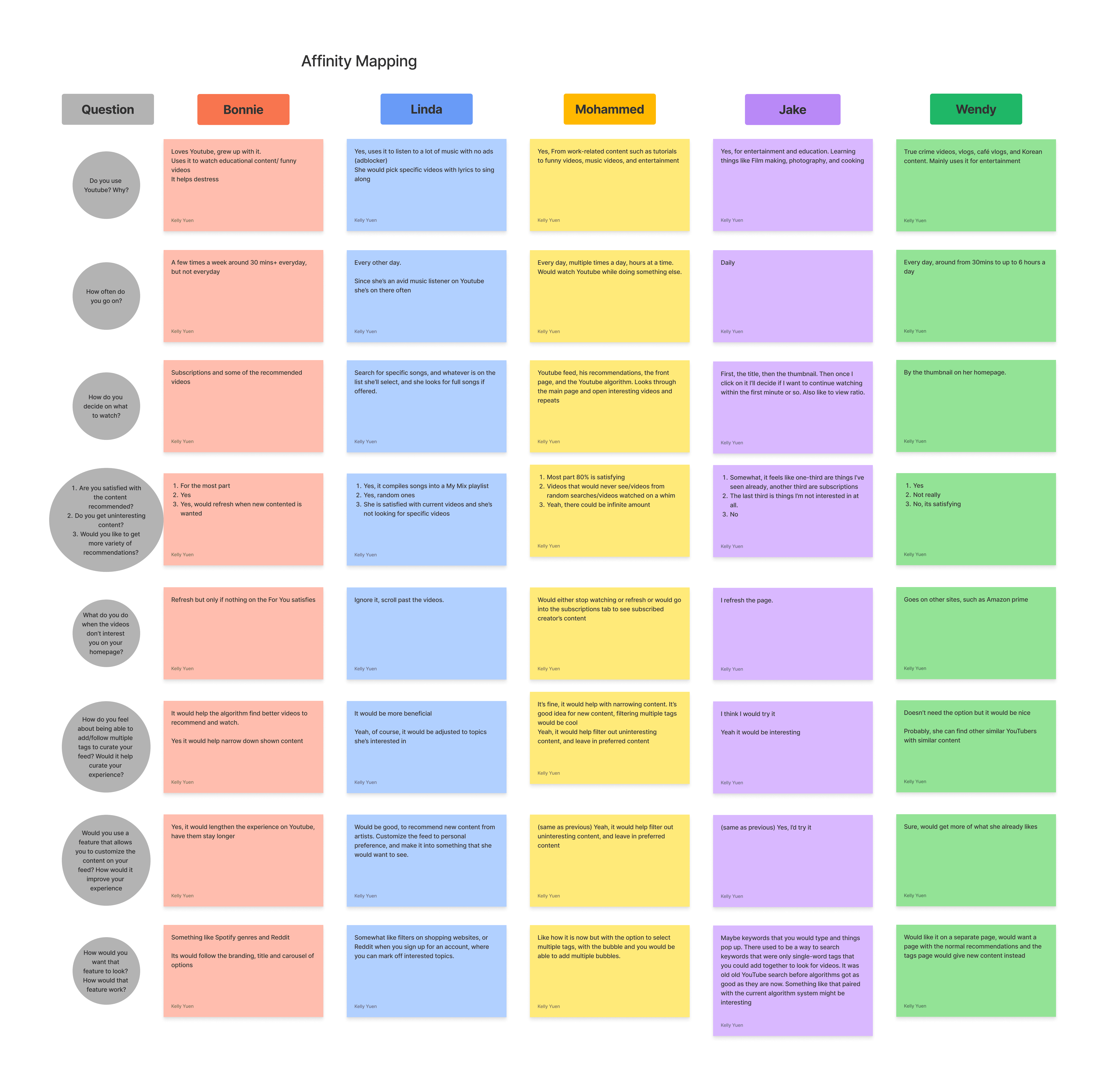
Random and uninteresting videos pop up on their feeds
When there is a lack of interesting content the page would be refreshed multiple times
Key Insights
Everyone interviewed mainly relies on their homepage for recommendations, not often do they search specific videos or look through their subscriptions
Interviewees for the most part are satisfied with the content recommended but are open to more ways to customize their content
Screen time on YouTube spans from 30 mins to up to 6 hours a day.
Define: Identifying User Requirements and Design Objectives for a YouTube Filtering Experience
Persona
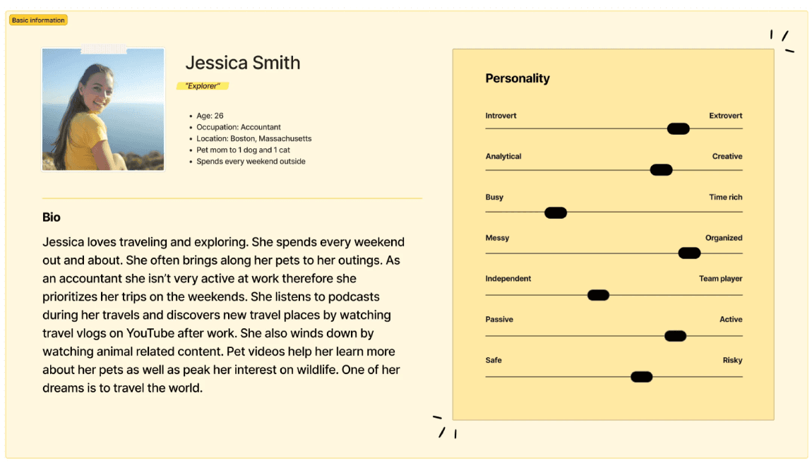
Our persona, Jessica Smith was created to visualize the average demographic of YouTube users. She represents a typical YouTube user who is an avid content consumer that values personalized and relevant video recommendations. Jessica is a working professional in her late 20s, with limited free time and a diverse range of interests. She relies on YouTube to entertain, educate, and inspire her, but often feels overwhelmed by the vast amount of content available. She desires a filtering feature that allows her to efficiently discover videos aligned with her preferences, saving her time and effort in finding relevant content.
Brainstorming Creative Constraints with POV and HMV
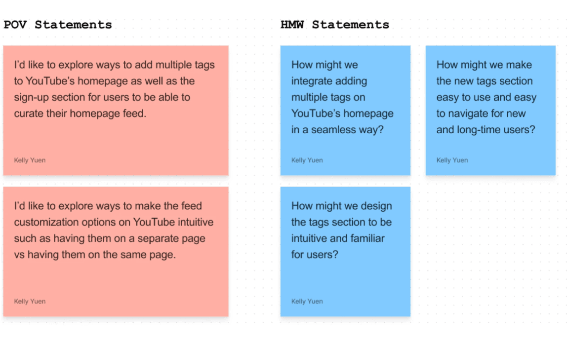
Using POV and HMW statements I was able to narrow my focus on what designs to create and test.
Keeping the layout of tags at the top of the homepage but when you select a tag you can add it to a list : The user is able to save interested tags to a list
In a separate section on the homepage, you are recommended videos from the tags you added. This is separate from the ones just recommended by YouTube (this would be if the tags section is on a different page on the homepage area for example there would be a “For you” and a “Your tags” area) : To create a separation from the usual Homepage while the new page functions the same. This gives the user the option to use or not use the new feature.
You can add and remove tags easily, You are shown tags you follow and you can manage it on the same screen via a popup without having to go into the settings : The popup makes adding and removing tags quick and simple
You are also able to filter your content by certain tags if you are specifically looking for specific videos + You are recommended tags but you may also search for tags in a popup. + Your tags apply to YouTube shorts as well. : These features allow the user to customize their content via tags.
Ideate: Brainstorming and Conceptualizing Innovative Filtering Feature
Brainstorming Visuals
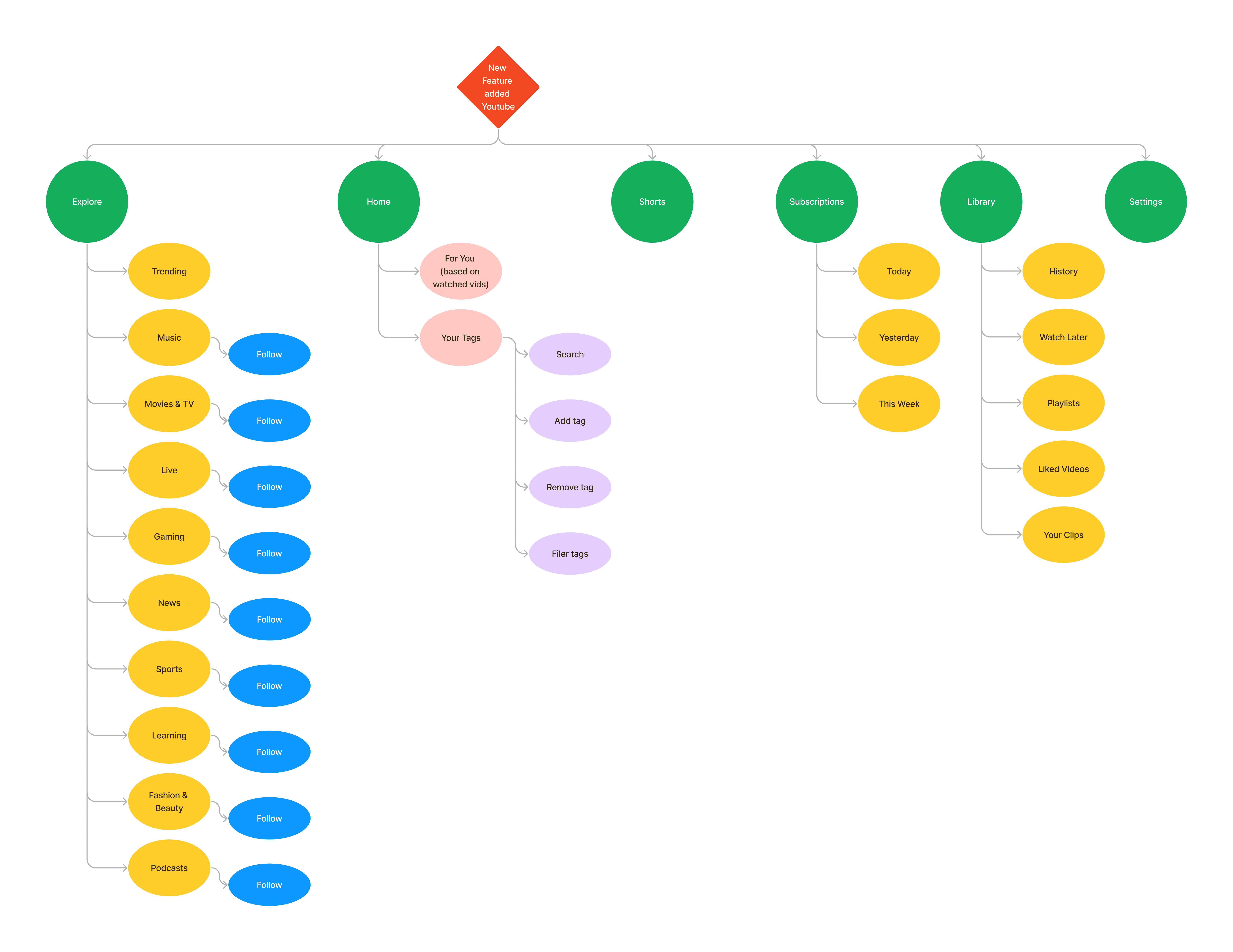
The tags feature would be added by having two separate sections on the YouTube Homepage. One would be the “For You” section and the other would be the “Your Tags” section. The “For You” section is essentially what YouTube is right now and the “Your Tags” section would be where all the tags you’ve added before appear. There you’ll be recommended tags to add as well as able to search, add, remove, and filter tags for content.
The tags feature is added to the current look of the YouTube homepage. Instead of a separate section for the added tags, it would be a segment of the page when you scroll, much like the shorts segment. The page would then have more labels/ titles to let the user know what section they are in. The tags segment would be the topmost one where the tags currently on YouTube are displayed. You’ll able to search, add, remove, and filter tags at their current spot.
I decided to go with Idea #1. It is more organized and doesn’t change the already existing Homepage. Instead it separates the new feature into a different tab letting those who want to use it, use it.
Sitemap
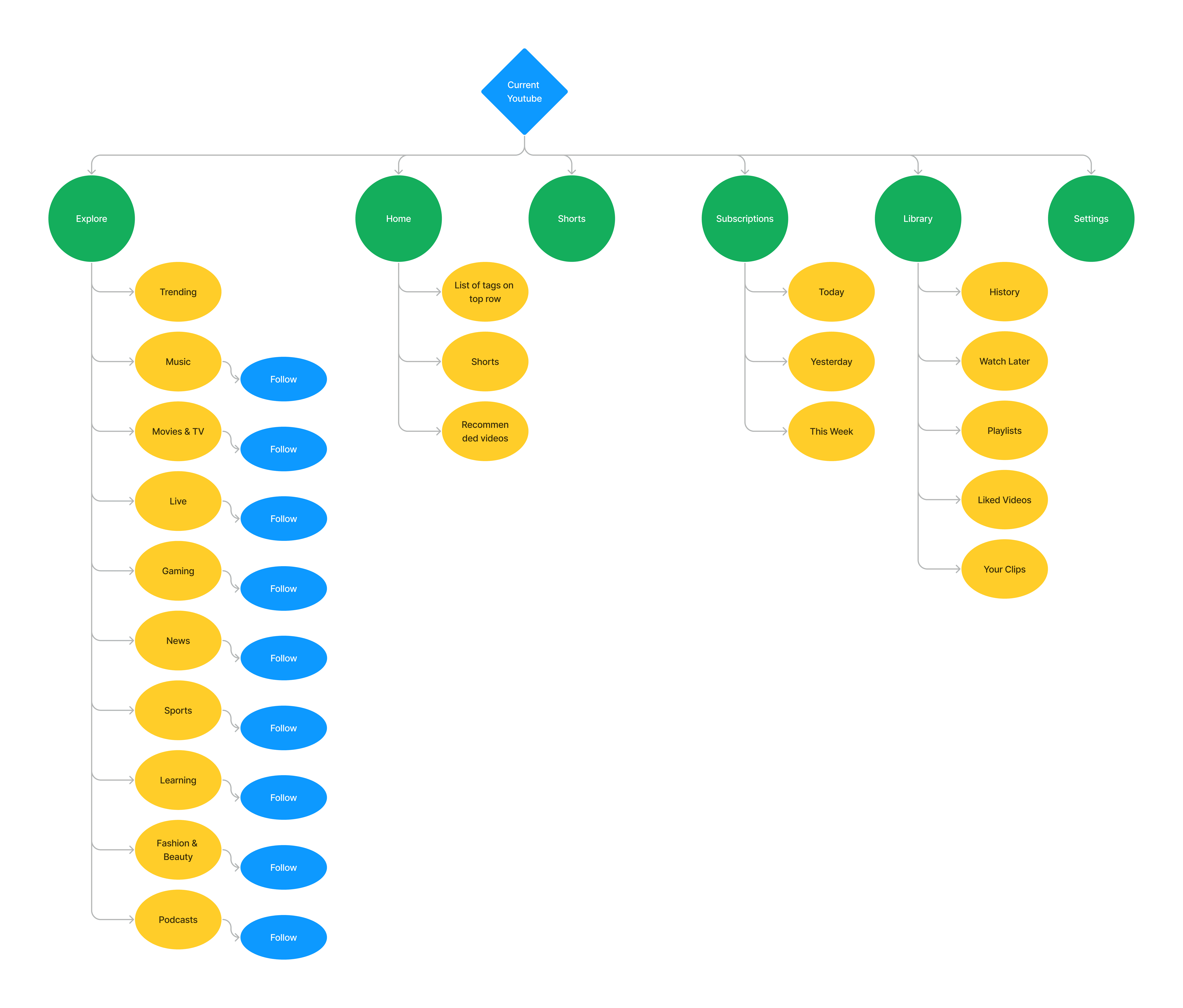
I created a sitemap of YouTube in current time and another one with the new feature added to show how a new filtering feature would fit into the current design.
Following my design explained in Idea 1, I added the new feature as a link you can access from your Homepage. It does not disturb the current sitemap of YouTube, instead it builds on what already exists. The recommended page still exists while the filtering page is a link you can access where you can manage your tags.
User Flow
This user flow demonstrates the process of adding and removing tags. It begins with users accessing the YouTube platform and navigating to the tags page from the homepage. From there, users have the option to add or remove tags. If they want to add a tag, they are able to search the tag and select them to add. If users want to remove a tag they browse their existing tags and select those from the list they want to remove.
Design Inpiration
I drew heavy inspiration from Tumblr due to their intuitive design for their tags management feature.
On the left two, you see the ability to choose and utilize several tags. On the right it shows the popup where you manage your tags. The popup for tag management was neat, organized and easy to navigate.
Design: Putting it all together
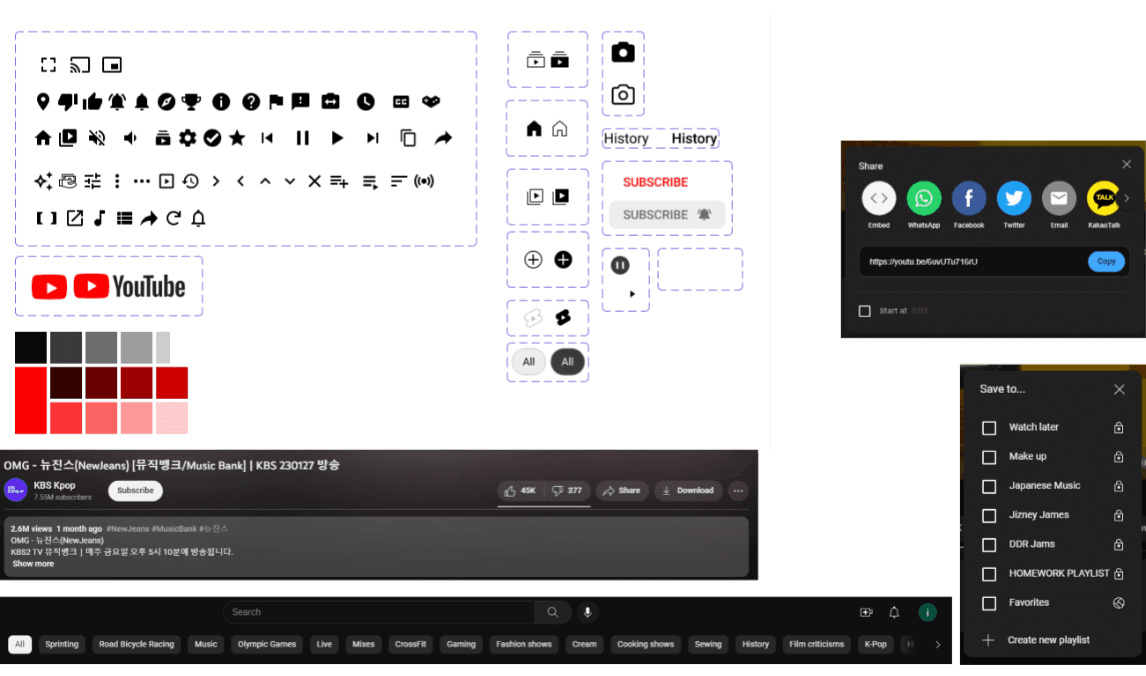
UI Kit
YouTube’s UI and buttons were followed closely in order for the feature to blend in seamlessly. Close attention was paid to matching the looks of popups and action buttons along with search bars
Sketches
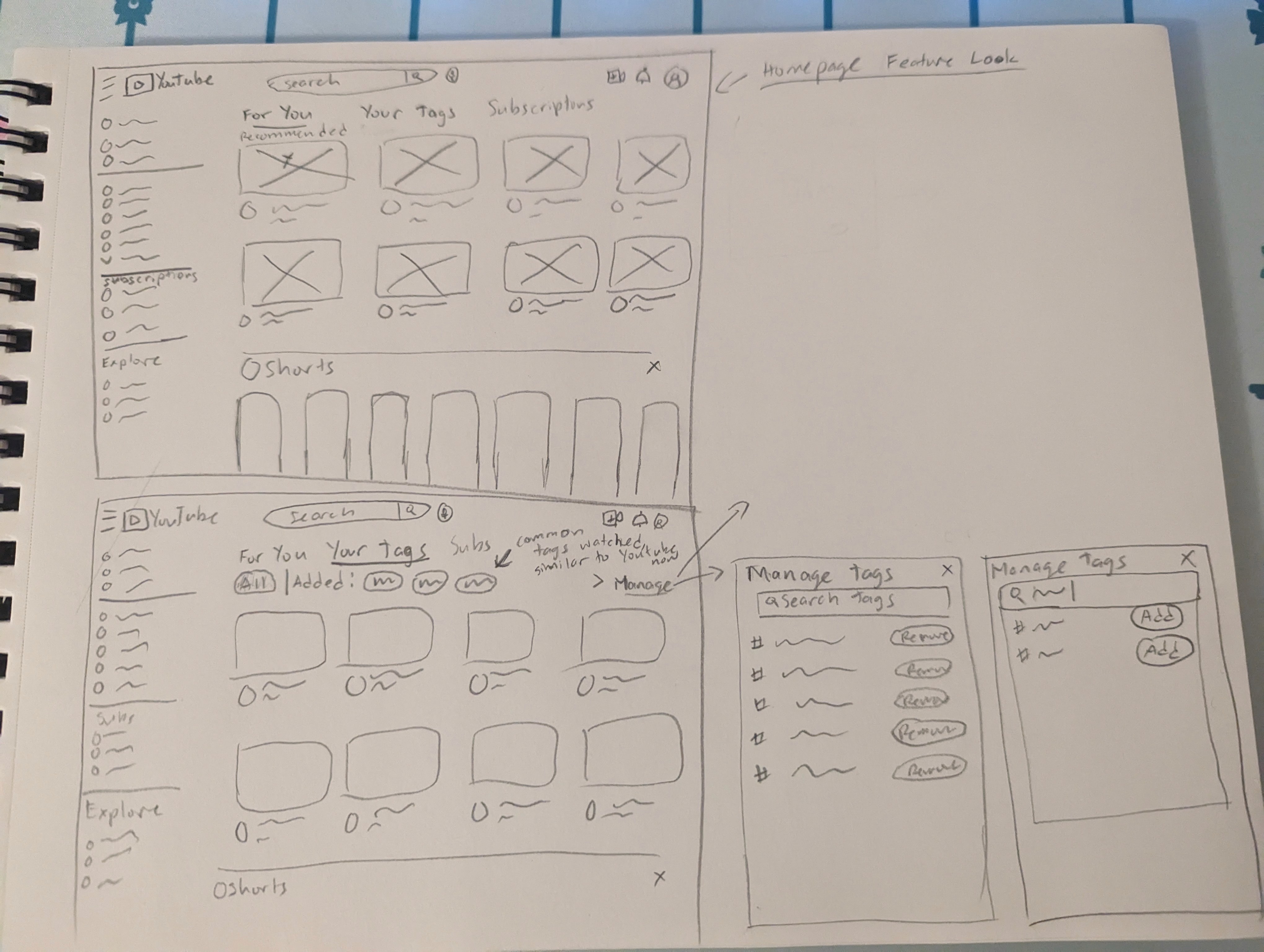
Idea 1 was sketched out showing where the Tags feature would be located. It incorporates YouTube's current design where the tags for filtering would be located and a Manage tags popup for adding and removing tags.
High Fidelity Wireframes and Prototype Flow
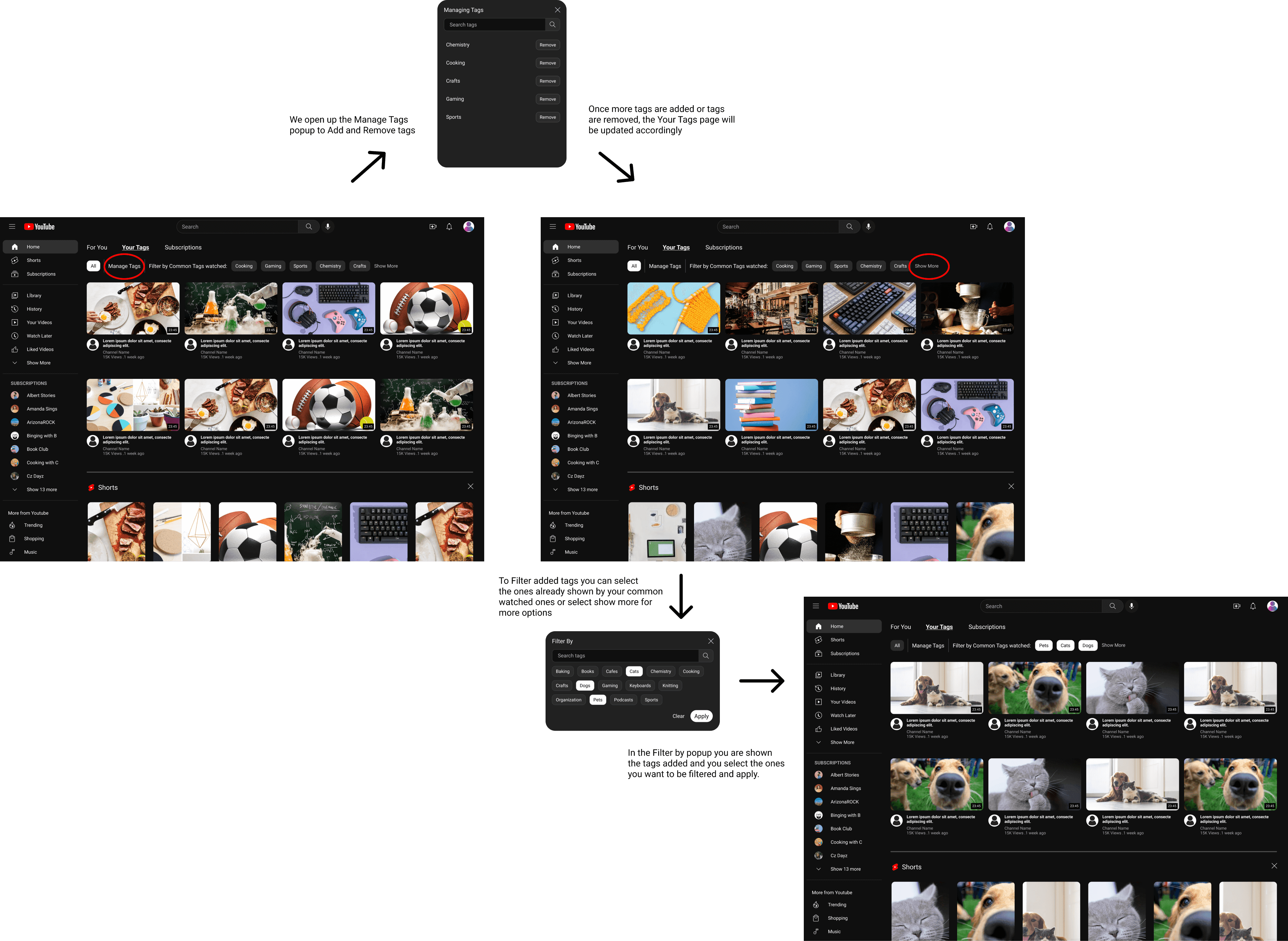
We go through the process of added and filtering tags in this flow.
Manage tags and filter tags are buttons the user selects to perform corresponding tasks.
All the tags are organized in the Managed tags for the users to scroll through or search
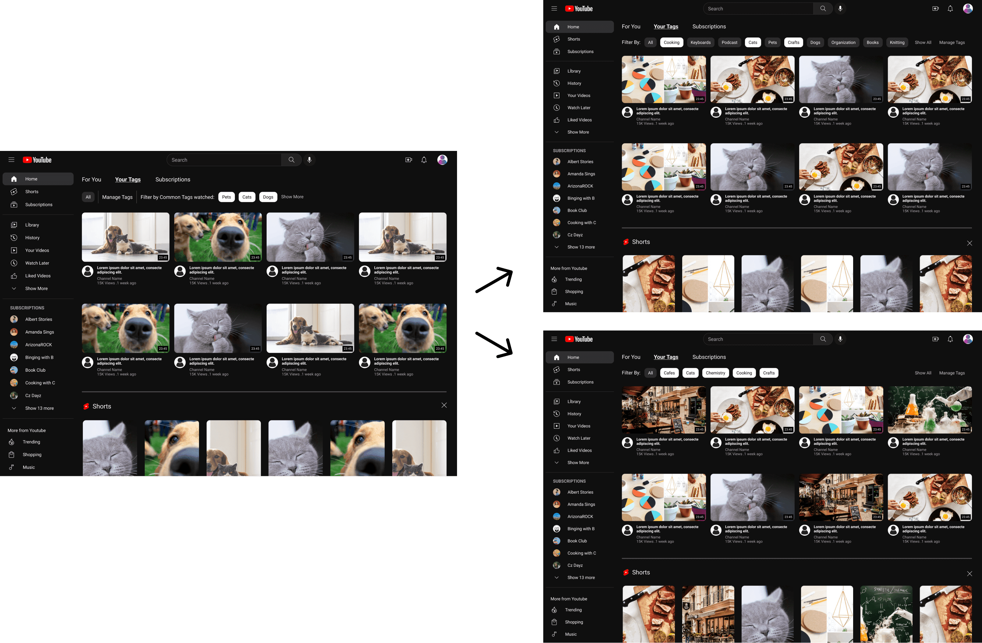
Along with the Filter tags(view more) button the user is also shown common tags they watch for quick filtering similar to the current YouTube except they are able to select more than 1 tag
Once you apply your filters your feed only shows videos related to your tags
Post Design: Feedback, Reiterations and Final Product
User Testing and Reiterations
Three individuals were asked to test the prototype. The main testing goal was to see if the user could complete the task smoothly without additional help. It was also important they interact with the feature smoothly and navigate through the user flow without getting stuck or confused.
User Flow tested:
The user is to add all recommended tags as well as all pet-related tags. From there they must filter by all the added pets tags and select a preferred video. From there they can also explore the video suggestions.
Demographic:
Age range- 10s to 30s / YouTube experience- Frequent users, 10 to 40 hours a week
Success measures
How well they interact with the feature
Users should be able to use the new feature without any issues or confusion.
The feature is intuitive and straightforward/easy to understand.
Users can navigate the feature without trouble.
Results
The results were quite unexpected;
3/3 of the testers felt the design was confusing and non-intuitive
3/3 were unsure and overall confused by the filter function. They didn’t understand how they differed from one another.
2/3 were unable to locate the add tags section and use it as intended
Feedback Grid
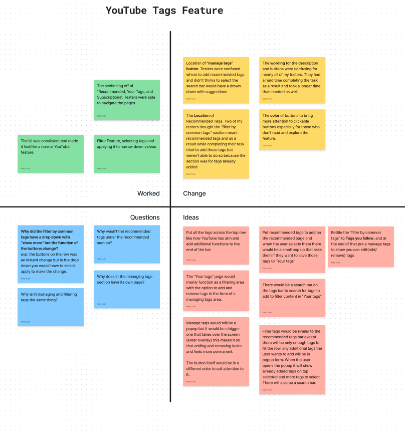
I received a lot of feedback and organized the information with a feedback grid. I applied many of the suggestions from the change section as well as went over and incorporated a lot of suggestions from the ideas section.
Key Changes Made
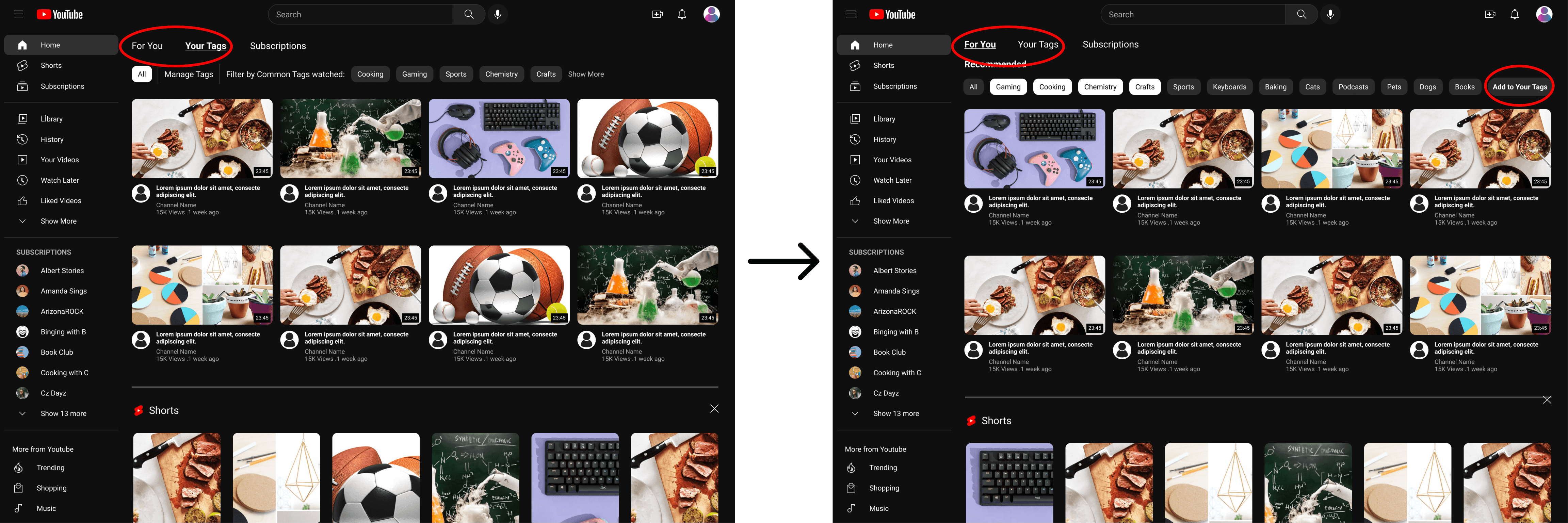
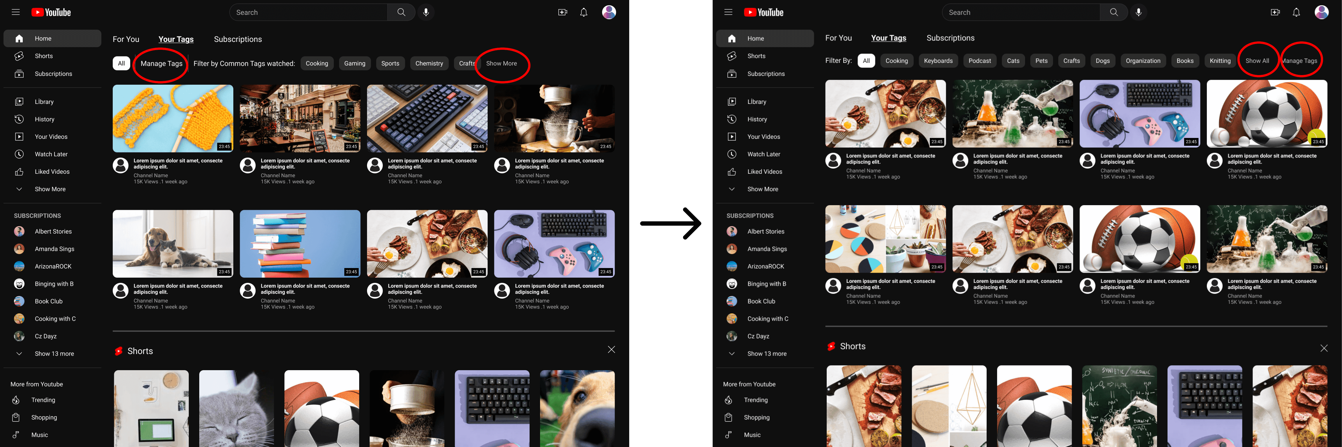
I added the option to add tags to your "Your Tags" feed directly from the usual "For You" page. Most of my testers were confused as to where they went to add tags since "manage tags" was a place they would go to manage what they already have. To resolved this issue I added a "Add to Your Tags" button on the main page to start off the process. On the "For You" Page" you are also able to add multiple tags to filter your feed.
The tags bar on the "Your Tags" page was reconstructed to be more intuitive for the user. I moved the "manage tag" button to the back of the bar and moved the description of the tag bar to the front along with changing the wording of the description. This improves the visual hierarchy of the tags bar, letting the user see their row of tags without a break in the middle. The options, "Show all (filters)" and "Manage Tags" fit better at the end of the bar since they are for editing purposes.
How filters are applied hasn't changed but the wording for additional tags not shown on the screen has changed from "Show more" to "Show all" to avoid confusion. The tags you selected on the bar also will show up selected when you open the "Show all" popup.
Conclusion
Project Takeaways
With the addition of a more intricate tags management feature, YouTube’s users can benefit from a more personalized home feed.
It is important to stay focused and prioritize designing for issues that are established as solving one issue may lead to many others arising.
Prioritize the functions you want to prototype. Design tools such as Figma have many prototyping features but it is important to prototype the main features. It is also impossible to prototype your feature to work 100% seamlessly so prototype with the mindset of making a minimum viable product.
Even though the original high-fidelity wireframe seemed intuitive to me, the designer, it is not the case with everyone. This solidified the importance of user testing and feedback to iterate and improve on the early design of the feature.
Next Steps
More testing and reiterations need to be done to ensure the design is understandable to the users.
Recruit more testers of different ages and originating from different backgrounds to diversity the feedback given.
Implementing a more complex prototype that has fewer technical constraints for the testers to be able to fully immerse in the product.


